|
Monday, September 10, 2012
ASG: resume



Tuesday, September 4, 2012
HTML Email Research

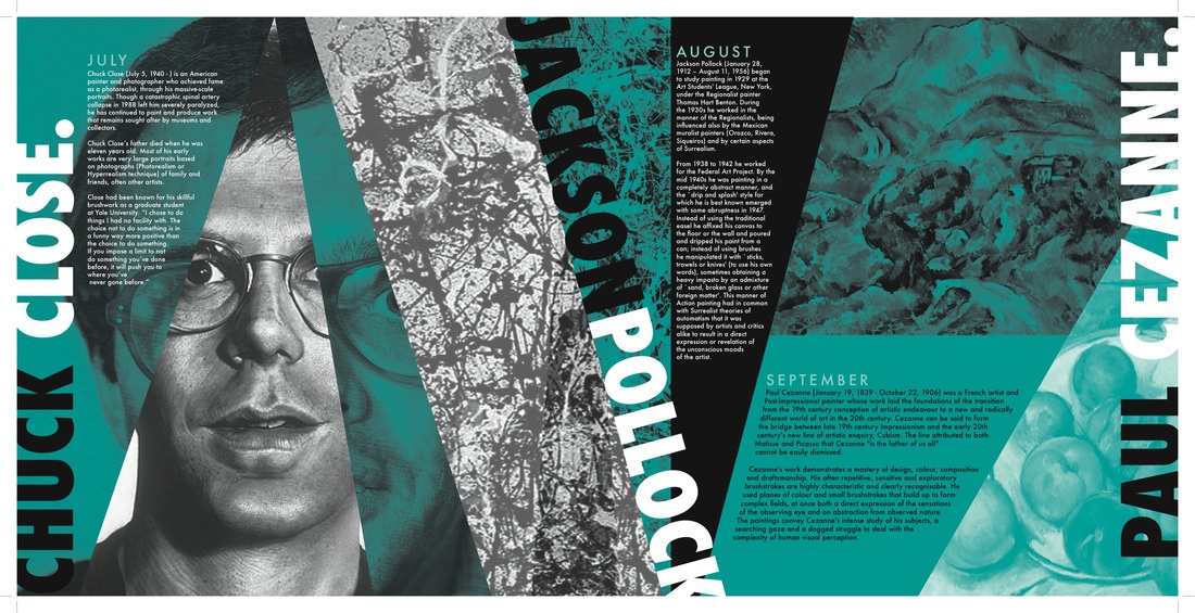
I really like the landscape orientation of this example, and the layout with the vertical type on the left and then horizontal type for the main part of the display.

I like the square size of this one. I like that it does not appear to be a normal shape of a piece of paper. I like the simplicity as well and no fancy graphics. The important info is large.

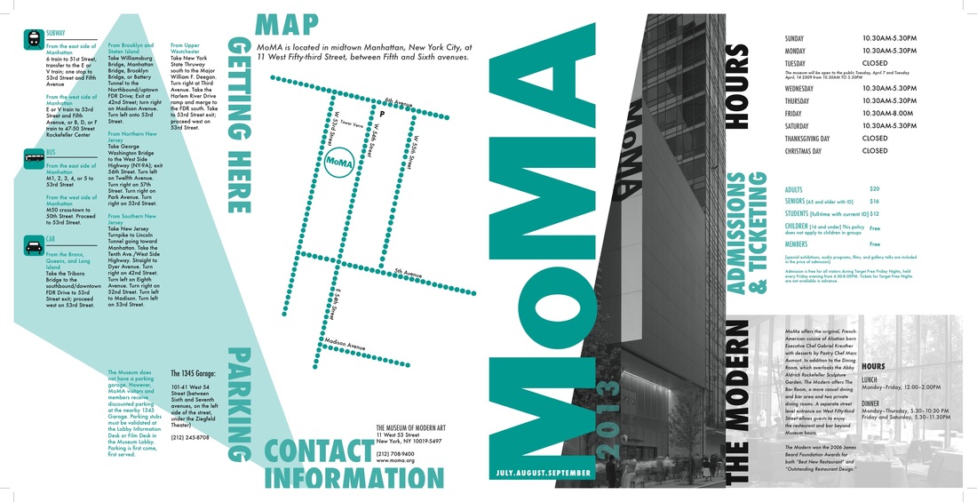
I enjoy the strips of color in this one and how line is used throughout it, and how the type compliments where there is line used. The orange really pops which is nice as well. I like the reversed type-white.

I like the use of the image as the background in this one, but it does not distract from the main information.

The way the space is broken up is really nice, and designates different areas of emphasis in the email.

The space is broken up nicely, special box with important information. Image is not overwhelming in the space. Organized spaced out information.

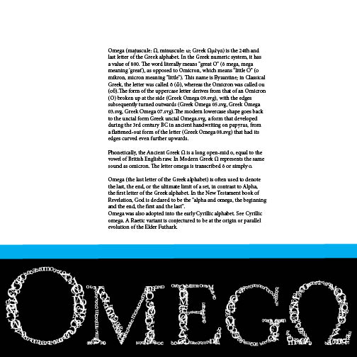
This one is simple, but presents a lot of information in an organized, straightforward way. I like the color and how it pops to grab the readers attention. The border is really important to the composition as well, and works nicely.

This one has a good balance of image versus information. The way it is split in half is nice and keeps everything in a separate space, not confusing the viewer.

This has a lot of information organized alongside of the images. The images balance the text nicely, and give a snapshot of what the text is about. The colors grab the reader's attention.

The image in this converse ad take up about a half of the space, but it works really well and is dynamic in the way that it breaks out of a boxed space. I enjoy how the images are not boxed in, but freely arranged on the plane.

The McDonald's ad displays the information in a boxed order, really nicely. I like the arrangement and how the boxes are all rounded off as well. The ad also is pushed to the top and the "boring" information is not really designed but still noticed on the bottom- the main information is the focus then.

This one is landscape orientation with a banner running along the top, organized well.

I like the way banners, and bars of color/information are used in this one.
Monday, August 27, 2012
Subscribe to:
Posts (Atom)